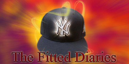
Today's cap features a team that quite possibly may be more known for a 1989 Charlie Sheen comedy, than for their actual history. This is the cap that the Cleveland Indians wore during a three season span between 1974 and 1977. In those three seasons at Cleveland Municipal Stadium, the tribe experienced some highs and some lows, but none more notable than the night of the the infamous ten cent beer night. On June 4th in 1974 team management conjured up a scheme to draw a larger crowd than normal due to low attendance issues. The plot: sell 8 ounce beer's for ten cents a cup all night. Sounds like a fun night, but once one or two turned into 47 shit hit the fan. In the ninth inning the surely intoxicated crowd crossed the line as one fan jumped onto the field in efforts to steal a Texas Rangers' fitted cap off of his head. As this occurred, Rangers players came in defense of their teammate with baseball bats in hand, as a sea of fans stormed the field with knives, chains, and pieces of stadium seats. As the smoke cleared, it was clear to see that this was not going to be an annual promotional event in years to come. The Indians have had an interesting history along the way, this event included, but seemingly can't find their way to winning the World Series. The last time they participated in it was in 1997 against the Marlins in which they lost, but have not won since 1948. Some of The Tribes most notable alumni are Lary Doby, Bob Feller, and Bob Lemon. All greats in their own right, but the club has not had many of recent to speak of. Maybe upper management will wake up and make some moves to get a name worth knowing in the lineup, and make headlines of their owns and not fiasco's at the ball park. Check out the current arsenal of Indian caps below.
Find the caps The Tribe wears here: http://cleveland.indians.mlb.com/index.jsp?c_id=cle
Wednesday, November 17, 2010
Tuesday, November 16, 2010
Baseball by the beach
Hey fitted fans, today we have an older minor league fitted thats sure to please. The gem of a cap before you is a retro Lakewood BlueClaws fitted. This cap was used as an alternate a few years back, but has since been halted in production due to a newer logo. The BlueClaws are one of two MLB affiliated baseball teams left in the great state of New Jersey; The Thunder who are the other and have been mentioned in prior posts, play in Trenton. My first encounter with the Lakewood franchise was in the summer of 2007 as I watched them play the Delmarva Shorebirds, an affiliate of the Baltimore Orioles. This South Atlantic League match-up proved to be lack luster as some minor league games can get, but I found myself stuck in the team shop behind home plate at FirstEnergy Park. Sure, they had jerseys, shirts, shorts, etc., but what I found myself staring at was the copious selection of New Era Fitted Caps. The caps all featured this logo on:
This is truly one of my favorite logos in all of baseball due to its color choices and creativity. This is a logo design that truly fit the team and the city it plays in. The cap I bought above has a red brim, a navy blue crown, and this guy shown above located on the front. The new logo is OK, but I feel this was the one to stick with. You can find the link to the team shop below to see more caps. Enjoy fitted fans!
Find the new BlueClaws merch here: http://www.minorleaguebaseball.com/index.jsp?sid=t427
Monday, November 15, 2010
Something in Burlington other than some coat factory
After a brief break due to a long weekend we are back with a buzz... That seemed too easy.. In any event, this is a throwback cap of the Burlington Bees. The Bees are a single A affiliate of the Oakland Athletics. This team, which may not have worldly acclaim, does have quite the history in its rear view mirror. The Burlington club has been a part of baseball since 1924, and a part of the Midwest League of Minor League Baseball since 1962. Prior to their current West Coast affiliation, the team has had a rap sheet of sorts as far as teams they've been in cahoots with. Their most recent extended relationship was with the Kansas City Royals from 2001-2010. The team plays their home games at 2712 Mt. Pleasant Street, at the 63 year old ball park known as Community Field. This old park seats a cozy crowd of 3,200 fans, and is said to have one of the most intimate atmospheres in all of small town baseball. Some of the most notable former Bees are Ruben Sierra, Vida Blue, Paul Molitor, Larry Walker, and Kenny Rogers . This cap featured, which keep in mind is an older logo, has a yellow brim, royal blue crown, with an insect of the arthropodic variety wielding a more than likely tooth pick sized bat. Kinda elementary, fun, and simple, but hey isn't that what minor league baseball is about? you can find the teams current cap at the link below. Enjoy and see ya tomorrow.
Find the current cap of the Burlington Bees here: http://gobees.milbstore.com/store.cfm?dept_id=658&store_id=55&parentID=658
Thursday, November 11, 2010
The Madison Madhouse Men
In continuation of hockey week here on TFD, we take a more in depth look at the defending Stanley Cup Champions, the Chicago Blackhawks. The Blackhawks, one of the Original 6 NHL franchises, have been a member of the league since the 1926 season. As one may assume, with such a long tenure and history in the windy city, a successful past precedes them. In their years, they have found themselves as the league champions 4 times, captured two conference championships since the league began keeping count, and an impressive 14 division championships. Enough about the team, let's get to the logo. The original incarnation of what was voted the best logo in hockey, was originally designed by the wife of the clubs first owner, Frederick McLaughlin. The drawing originally illustrated by Irene Castle was first rendered in 1926 and has had multiple drafts since day 1. The logo has inspired the creation of a team mascot named "Tommy Hawk" as a form of homage to the Native American influence in the teams name. With the roster the Blackhawks have today, along with their great tradition, and incredible fan base they are sure to take a ride on the road to success for quite some time. As they made their run to The Cup last year, homegrown youngin's Patrick Kane and Jonathan Toews helped greatly as they established their presence early and often throughout the playoffs. The cap featured has a black crown, black brim, and the traditional four feather Native American Blackhawk logo that we all know and love on the front. This is truly a classic logo that looks great on caps, jerseys, shirts, etc. I doubt I will ever get sick of looking at this one any time soon. You can find merch with the afore mentioned logo at the link below, now go pick up one of the greatest logos in sports!
Wednesday, November 10, 2010
Goals Gone Wild
In continuation of Hockey Week, today we feature the Minnesota Wild. The Wild are the current NHL franchise located in the Twin Cities, since The Minnesota North Stars left for Dallas in 1993. After the departure of the Stars, there was a seven year absence of hockey in the land of ten thousand lakes; Hockey was a way of life in Minnesota and it was clear that this would not be a franchise-less state. Prior to the 2000 NHL season the origins of a team began to sprout. After voting on a new name and colors, a new team was born: The Minnesota Wild. It was clear that the community would appreciate a team, as the franchise had a deal to build their own arena in St. Paul within months of their creation. The Xcel Energy Center seats 18,064 fans, and has a record including standing room with 20,554. In their already ten year history, the franchise has won one division title in 2008, but has yet to win a conference of Stanley Cup Championship. The all time scoring leader for the Wild is Marian Gaborik who has 437 points in 502 games played for the club. The cap featured has a white crown, a forest green brim with the crisp and favorable Wild logo front and center. There have been many debates of to what the logo actually is, most feel it is either a bear or a wild cat. Either way, it's a great logo which pays homage to the great tradition of hockey in Minnesota. The logo also pays homage to the history of hockey in the twin cities as the North Star is featured as the eye of the wild animal in the logo. Minnesota: a proud state, with a great tradition of hockey, and a bright future in the Wild.
Caps like the one featured can be found here: http://www.ecapcity.com/catalogsearch/result/?q=wild&x=9&y=13
Tuesday, November 9, 2010
Talent Scouting
This gem of a cap features the logo of an NHL Throwback team. The Kansas City Scouts were an NHL franchise located in Kansas City, Missouri. You may know them as the present day New Jersey Devils. In between the two destinations they also had a brief 6 season stay in Denver as the Colorado Rockies (1976-1982). The Scouts which called the KC area home for two seasons won 27 out of 160 games played; Needless to say a less than stellar history. The Scouts were one of two NHL expansion teams in their first year of play along with the Washington Capitals. The franchise played their home games in Kemper Arena. After the franchise left for the Rockies, big league hockey was never to return to Kansas City. There were a few stints of minor league teams, but nothing big to speak of. Through the trials and tribulations those who wore the scouts jersey laid the foundation for one of the most notable NHL franchises of the last 30 years (The New Jersey Devils). It just goes to show you that everything has to start somewhere. The cap shown has a navy blue crown and brim with a red circle and white inside displaying a Native American on a horse seemingly scouting out territory on the horizon. Awful franchise, great history after Kansas City, and a cool logo. Hats featuring the Scouts logo can be found at the link below. Enjoy!
http://shop.ebay.com/?_from=R40&_trksid=m570&_nkw=kansas+city+scouts+cap&_sacat=See-All-Categories
Hockey Week!
This week on The Fitted Diaries were going to do something a little different. As you all know, fitted caps don't necessarily only pertain to baseball. There are caps for all types of sports and this week we will be featuring a bunch of NHL inspired fitteds. Remember, this is only for a week so send some feedback on what you think about this little change of pace. Enjoy!
Sunday, November 7, 2010
2nd rate
Remember when you were a kid, and you would always let your little brother win sometimes so they wouldn't feel bad? Well, anyway today's featured cap is that of the New York Mets. The Metropolitans, which are a hybrid offspring of the Giants and Dodgers from when they vacated NYC for Cali, head into their 49th season in 2011. The Mets are a franchise whom spent the 5th most on contracts this past season, and only managed a record of 79-83. Though this team has been deemed lovable loser more than once, I feel that their fans deserve much more than they get. The team of late has looked solid in April, and yet somehow has been reduced to a AA roster by July. In their history, the team has captured 4 NL pennants and 2 World Series titles; results which render the nick name of "The Amazins" somewhat evasive. In any event, maybe this somewhat under performing team will finally wake up and smell the proverbial bacon with new General Manager Sandy Alderson. Alderson, who had success in Oakland 20 or so years ago as a GM knows what winning is all about. Unfortunately he wont have Canseco, McGwire, or steroids to help this time around. Next up on the to do list of the Mets is to find a manager. Taking this job would be like begging for an STD, and personally I can't think of many who are interested in that. This cap, which features a black crown, brim, and an interlocking NY on the face can be found at the link below. Good luck Mets, your gunna need it.
Find this cap here: http://shop.mlb.com/product/index.jsp?productId=2626725&cp=1452359.1452831
Saturday, November 6, 2010
Eh, How bout dem Jays
Today, we have a throwback classic from the Toronto Blue Jays. This is the cap the team wore in the mid 90's to the 2000's. I picked this beauty up while on my first trip to Toronto 6 years ago. I had been in the area to watch the Yankees play, and to possibly see right fielder Gary Sheffield hit his 400th career home run. Upon my arrival in the city, we became engulfed in the shadow of the grand structure that is the Skydome. Now it's known as The Rogers Centre, but none the less the "epicness" remains. The Skydome is a football and baseball facility which was opened in 1989 and seats up to 54,000 on a full night. It is a signature point of the Toronto skyline and can bee seen from miles away. While in the Golden Horseshoe (Toronto's nickname), I watched as the Yankees won both games I attended as Mr. Sheffield hit his milestone 400th bomb. A really cool part of the city is the CN Tower. Its a space needle type structure that allows you to see all of Toronto from the top, and down into the Rogers Centre on a day when the roof is open. Great trip, great city, decent baseball team. The fitted above has a blue crown, blue brim, and a Blue Jay head with a red maple leaf in the background. Chances of finding this fitted around aren't very good, but I'll link a Ebay search on the bottom of this post. Have a great Saturday night, and come back tomorrow. Peace!
Find caps like this one here: http://shop.ebay.com/?_from=R40&_trksid=p5197.m570.l1313&_nkw=toronto+blue+jays+hat&_sacat=See-All-Categories
Friday, November 5, 2010
Rays of hope
This is a throwback cap of the Tampa Bay Rays. When they wore these, and when I took a trip down to Florida a few years ago, they were known as the Devil Rays. Today, same team, same stadium, different attitude. The team, which is now known as the Rays (portrayed as a ray of light, due to Florida being the sunshine state) has found a brighter horizon. Along with the name change came a new state of mind for all who participated in the day to day operations of the team. Since the name change, the franchise has made it's only two post season appearances, and even made it as far as the World Series two seasons ago. Upon my visit to St. Petersburg (where the Rays actually play), I watched a dismal Devil Rays club play a powerful Los Angeles Angels of Anaheim team. The Angels won by at least 7 runs and walked all over the Florida team with no regard for human life. Out of site out of mind I suppose. Now with their powder blue, navy blue, and yellow color scheme they have all but distanced the memories of the past from their minds and have established a mission for success. While the logos, jerseys, and memories of the old Devil Rays will live on for now, the team is headed in a new direction and has shown no sign of slowing down. The cap above ceased being worn at the end of the 2007 season, but you can still find it and the others in the uni set in the link below. The cap has a black crown, forest green brim, and a T B with a Devil Ray swimming beneath it all outlined in blue. I bet the ghost of Steve Irwin wasn't the only person to welcome the change of scenery in the ballpark of Tampa. Croyke!
This cap can be found here: http://shop.ebay.com/i.html?_nkw=devil+rays+cap+&_sacat=0&_odkw=devil+rays+cap+retro&_osacat=0&_trksid=p3286.c0.m270.l1313
Thursday, November 4, 2010
This ship wont sink
Today's cap is that of the Columbus Clippers of Minor League Baseball. This cap I picked up on my first trip to Ohio when I was 16, during the 2005 season. At that time, the Clippers were affiliated with The New York Yankees. Upon my visit, I watched players such as Ramiro Mendoza, Andy Phillips, and a young Robinson Cano. While in Cooper Stadium, all I could think and feel was the history of the historic ball park. These were grounds that had seen some of the most cherished players of my youth such as Bernie Williams, Derek Jeter, Andy Pettitte, Mariano Rivera, and Jorge Posada. As far as I was concerned it was essentially a breeding grounds for excellence. As I sat in the old stadium, seemingly industrial as was the city it resided, I almost heard the echoes of a time ago which held a resonance of pride. The Clippers won the game against the Charlotte Knights as I watched with awe speculating who would be the next Yankee great in this sea of infinite talent. Former Pinstriper Bucky Dent shook hands with his players following the victory with a sense of pride and expectation of success. The team is now an affiliate of the Cleveland Indians and has a different logo set at this point in time, but the memories of the past will never disappear. This cap has a navy blue crown and brim, with a Cursive C encircling a large Sailboat with baseball seam sails. A classic Cap, a great tradition, and a fantastic memory. The current cap of the clippers can be found below, enjoy!
Find the new Columbus Clippers cap here: http://clippers.milbstore.com/store_contents.cfm?store_id=53&dept_id=696&product_id=14762
Wednesday, November 3, 2010
Jonrón!
Hola!, and welcome back to The Fitted Diaries. Today's featured cap is the fitted of the Mexico National Baseball Team. This cap in particular was worn during the Caribbean Series a few years ago. This team has played in a few global tournaments throughout the years and has quite a successful track record. In the Pan American games the team has placed third three times capturing the bronze, in the Caribbean Series they have placed 8 times with 5 silver medals, and three bronze, and placed 5 times in the Baseball World Cup of past capturing 4 silvers and 1 bronze. The team is currently managed by former Colorado Rockies great Vinny Castilla, who also previously took the field for the red, white, and green. The team is currently ranked 8th in the world in the IBAF rankings, with an almost certain climb in the near future. Some of the more notable players to don this cap in the most recent installment of the World Baseball Classic are: Elmer Dessens, Rodrigo Lopez, Oliver Perez, Joakim Soria, Jorge Cantu, Adrian Gonzalez, and Jerry Hairston Jr. The teams next major competition will be when they compete in the 2013 World Baseball Classic, when the field of teams has been proposed to be expanded to 24 teams; This is truly becoming a global sport. This cap I picked up on the lids website a few years ago, but it can also be found at the link posted below at the mickey place store. andale y compro!
the cap can be purchased here: http://www.mickeysplace.com/mexico-carribean-series-p-2421.html
Thanks to http://www.uniwatchblog.com/ !
Thank you to Paul Lukas at Uni Watch for the shout out on todays post. It is honestly an honor to be mentioned on one of the greatest sports blogs out there. Head over to Facebook to join the fan pages for Uni Watch and this site as well. Keep checking the blog, chances are you may find out something new and maybe even find a cap you like. Thanks again Paul!
Tuesday, November 2, 2010
Justice is served
So finally, after watching my New York Yankees get spanked around by the Texas Rangers in the ALCS, they are finally exposed for the lackluster team that they really are. In honor of this, today we take a better look at the cap which is worn by the first place loser this season. This is the alternate cap of the Texas Rangers of the AL West of Major League Baseball. The franchise, which has been around since 1961, originated in Washington D.C. as the Washington Senators as an expansion team. That venture, which lasted a decade, resulted in relocation deep in the heart of Texas as the present day Texas Rangers (Insert Chuck Norris joke here). The rangers have had 2 stadiums to call home, those of which being Arlington Stadium, and their present stomping grounds known as Rangers Ballpark in Arlington. The current ballpark, which seats 49,170 was opened prior to the 1994 season. In their 40 season history in the Dallas area, the team has captured 4 AL West titles (1996, 1998, 1999, 2010) , and accomplished somewhat of an evasive goal of reaching the World Series, with an AL League Championship, this season. Although they did not win, they still made a great run and are sure to have a promising future, especially with new owner Nolan Ryan. The Rangers have two retired numbers other than the league wide Jackie Robinson 42, those being the afore mentioned Nolan Ryan's 34 and former manager Johnny Oates number 26. This cap, I picked up on the Lids website a few months back due to its somewhat throwback nature; it features a red crown, red brim, and a capital T in white and outlined in Ranger blue. This cap was originally featured back in the 90's, but was brought back to life two seasons ago as part of an alternate uniform. The link for this cap is posted below if you're interested in it. giddy-up cowboys and cowgirls!
The cap can be found here: http://www.lids.com/pid/20238088
New Official Logo!
Just want to throw a quick shout out to my boy Emanuele Genghini for designing this logo, its about time we make this thing look semi-professional. Look out for tomorrows post around 2pm, lets just say it's going to be red, white, blue, and a big fat loser.
Subscribe to:
Posts (Atom)